Gearing up something amazing for you…
Still waiting? Magic takes a moment! ✨
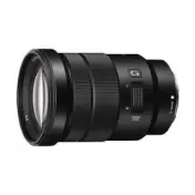
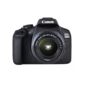
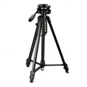
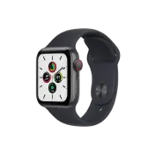
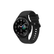
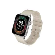
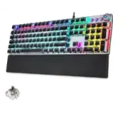
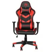
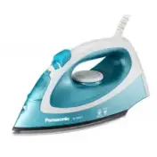
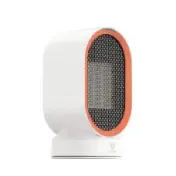
Unimart is a E-commerce Template. Worldwide electronics store since 1978.
Limited Item, checkout within 10m 00s
Subtotal (2 items)
$758.00
Shipping
$10.00
Total
$768.00
Add $248.00 More To Get Free Shipping
For orders over $9.90
For orders over $9.90

                                                <div class="alert alert-primary" role="alert">A simple primary alert—check it out!</div>
                                                <div class="alert alert-secondary" role="alert">A simple secondary alert—check it out!</div>
                                                <div class="alert alert-success" role="alert">A simple success alert—check it out!</div>
                                                <div class="alert alert-danger" role="alert">A simple danger alert—check it out!</div>
                                                <div class="alert alert-warning" role="alert">A simple warning alert—check it out!</div>
                                                <div class="alert alert-info" role="alert">A simple info alert—check it out!</div>
                                                <div class="alert alert-light" role="alert">A simple light alert—check it out!</div>
                                                <div class="alert alert-dark" role="alert">A simple dark alert—check it out!</div>
                                                <div class="alert alert-primary" role="alert">A simple primary alert with <a href="#" class="alert-link">an example link</a>. Give it a click if you like.</div>
                                                <div class="alert alert-secondary" role="alert">A simple secondary alert with <a href="#" class="alert-link">an example link</a>. Give it a click if you like.</div>
                                                <div class="alert alert-success" role="alert">A simple success alert with <a href="#" class="alert-link">an example link</a>. Give it a click if you like.</div>
                                                <div class="alert alert-danger" role="alert">A simple danger alert with <a href="#" class="alert-link">an example link</a>. Give it a click if you like.</div>
                                                <div class="alert alert-warning" role="alert">A simple warning alert with <a href="#" class="alert-link">an example link</a>. Give it a click if you like.</div>
                                                <div class="alert alert-info" role="alert">A simple info alert with <a href="#" class="alert-link">an example link</a>. Give it a click if you like.</div>
                                                <div class="alert alert-light" role="alert">A simple light alert with <a href="#" class="alert-link">an example link</a>. Give it a click if you like.</div>
                                                <div class="alert alert-dark" role="alert">A simple dark alert with <a href="#" class="alert-link">an example link</a>. Give it a click if you like.</div>
                                                <div class="alert alert-primary d-flex align-items-center" role="alert"><i class="fa-regular fa-bell me-2"></i>A simple primary alert with <a href="#" class="alert-link">an example link</a>. Give it a click if you like.</div>
                                                <div class="alert alert-success d-flex align-items-center" role="alert"><i class="fa-regular fa-circle-check me-2"></i>A simple success alert with <a href="#" class="alert-link">an example link</a>. Give it a click if you like.</div>
                                                <div class="alert alert-danger d-flex align-items-center" role="alert"><i class="fa-regular fa-triangle-exclamation me-2"></i>A simple danger alert with <a href="#" class="alert-link">an example link</a>. Give it a click if you like.</div>
                                                <div class="alert alert-warning d-flex align-items-center" role="alert"><i class="fa-regular fa-circle-exclamation me-2"></i>A simple warning alert with <a href="#" class="alert-link">an example link</a>. Give it a click if you like.</div>
                                                <div class="alert alert-info d-flex align-items-center" role="alert"><i class="fa-regular fa-circle-info me-2"></i>A simple info alert with <a href="#" class="alert-link">an example link</a>. Give it a click if you like.</div>
                                                <div class="alert alert-primary alert-dismissible fade show" role="alert">
                                                <strong>Primary Alert!</strong> You should check in on some of those fields below.
                                                <button type="button" class="btn-close" data-bs-dismiss="alert" aria-label="Close"></button>
                                            </div>
                                            <div class="alert alert-secondary alert-dismissible fade show" role="alert">
                                                <strong>Secondary!</strong> You should check in on some of those fields below.
                                                <button type="button" class="btn-close" data-bs-dismiss="alert" aria-label="Close"></button>
                                            </div>
                                            <div class="alert alert-success alert-dismissible fade show" role="alert">
                                                <strong>Success Alert!</strong> You should check in on some of those fields below.
                                                <button type="button" class="btn-close" data-bs-dismiss="alert" aria-label="Close"></button>
                                            </div>
                                            <div class="alert alert-danger alert-dismissible fade show" role="alert">
                                                <strong>Danger!</strong> You should check in on some of those fields below.
                                                <button type="button" class="btn-close" data-bs-dismiss="alert" aria-label="Close"></button>
                                            </div>
                                            <div class="alert alert-warning alert-dismissible fade show" role="alert">
                                                <strong>Warning!</strong> You should check in on some of those fields below.
                                                <button type="button" class="btn-close" data-bs-dismiss="alert" aria-label="Close"></button>
                                            </div>
                                            <div class="alert alert-info alert-dismissible fade show" role="alert">
                                                <strong>Info Alert!</strong> You should check in on some of those fields below.
                                                <button type="button" class="btn-close" data-bs-dismiss="alert" aria-label="Close"></button>
                                            </div>
                                            <div class="alert alert-light alert-dismissible fade show" role="alert">
                                                <strong>Light!</strong> You should check in on some of those fields below.
                                                <button type="button" class="btn-close" data-bs-dismiss="alert" aria-label="Close"></button>
                                            </div>
                                            <div class="alert alert-dark alert-dismissible fade show" role="alert">
                                                <strong>Dark!</strong> You should check in on some of those fields below.
                                                <button type="button" class="btn-close" data-bs-dismiss="alert" aria-label="Close"></button>
                                            </div>
Aww yeah, you successfully read this important alert message. This example text is going to run a bit longer so that you can see how spacing within an alert works with this kind of content.
Whenever you need to, be sure to use margin utilities to keep things nice and tidy.
                                                <div class="alert alert-success" role="alert">
                                                <h4 class="alert-heading">Well done!</h4>
                                                <p>Aww yeah, you successfully read this important alert message. This example text is going to run a bit longer so that you can see how spacing within an alert works with this kind of content.</p>
                                                <hr>
                                                <p class="mb-0">Whenever you need to, be sure to use margin utilities to keep things nice and tidy.</p>
                                            </div>